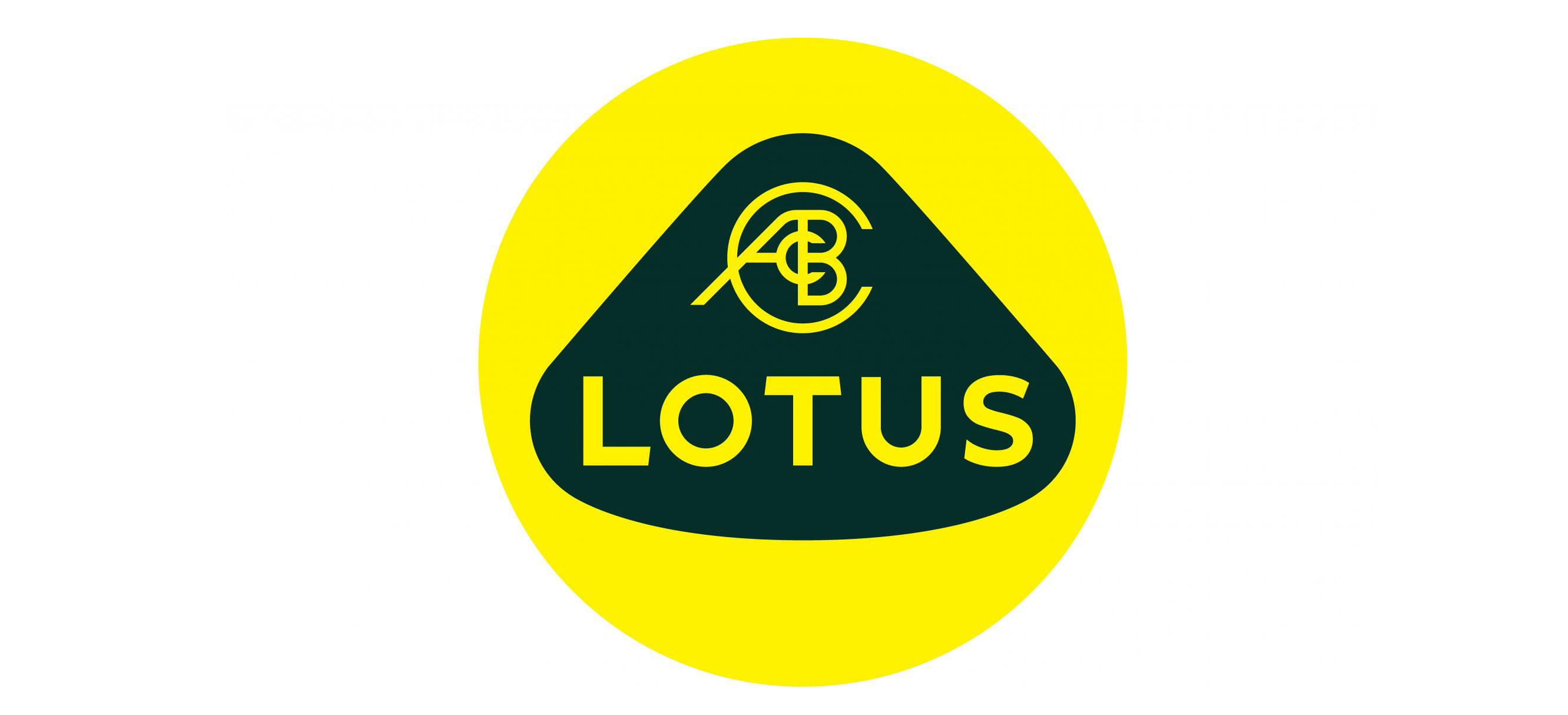
Lotus has a new logo. That’s it, above.
The change comes as the company embarks on a new era of expansion and a new generation of driver-focused sports and hyper cars including the recently revealed Evija. That car packs an ungodly amount of power (1,972bhp) and is the company’s first ever foray into full electric mobility. Really quite fast electric mobility, if we’re being honest.
There’s also lots more planned in the coming years – both with the site and global production, and renovation and regeneration of existing models.
So, a fresh new start for the company needs a fresh new logo. At least according to Lotus. “We’ve looked back at the original Lotus roundel and thought about Colin Chapman’s philosophy, to simplify and add lightness,” explained Lotus marketing boss Simon Clare.
“We’ve applied that to create a new roundel, taking the weight out of the lettering and adapting the spacing,” he added. The actual ‘Lotus’ lettering has been straightened, too, to bring it in line with the ‘Lotus wordmark’.
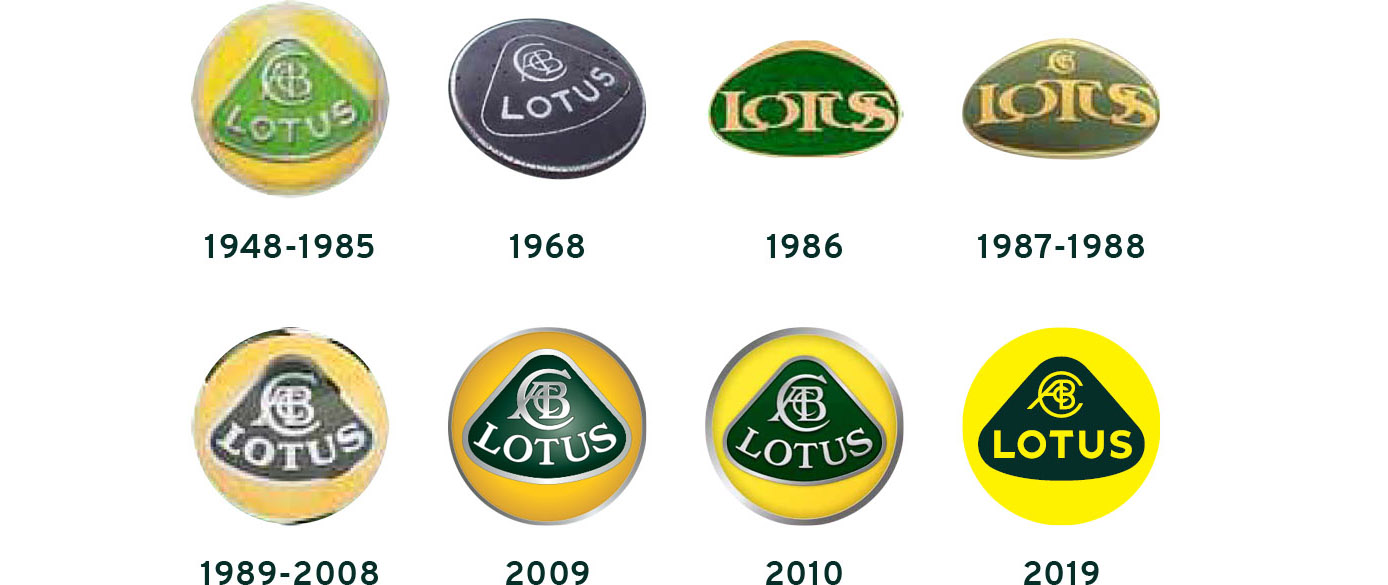
Yep, Lotus has actually simplified and added lightness to its logo too, as well as its cars. We’ll throw it over to you – what do you lot reckon? We’ve included a pic of Lotus’s roundel history for context.